Company
Founded in Pilsen in 1994, Bohemia model management moved operations to Prague in 1995 and quickly acquired of the leading positions thanks to talented staff, a portfolio of models that fit the needs mainly of the Czech market, and superior scouting which led to discover and launch models of the likes of Karolina Kurkova.

Problem
The website is disorganized. The gallery needs to improve its visuals. Company and model information would have to increase value and visibility.
Project Brief
Project Type: Individual
Tools Used:
· I-Pad
· Figma
· Illustrator
· Dreamweaver
· Photoshop
Timeline: 2 Weeks
Objectives
The idea was to refresh and redesign the current website.
To guide potential clients in the right way, make it easy for them to understand the value of the company and facilitate a great user experience by providing useful and relevant content
Showcase client´s work in a visually pleasing way emphasizing on loyality and proffesionalism of the agency
Process
· Empathize: Stakeholder interviews
· Define: User research, Problem define, Competitor analysis
· Analyse: User personas, User flow, Site map
· Design: Lo-Fi, Wireframes, Prototype, UI
· Test: Usability testing, Analyse and iterate
Old Website
After taking a look at the website itself, I determined contained a following problems:
1 · Error in the visual labeling of the image, contrast problem
2 · The splash screen takes up a lot of space and doesn't provide any information. The user may get lost right at the start
3 · It is necessary to make the Become a Model form more attractive. Evaluate what is most important for the company
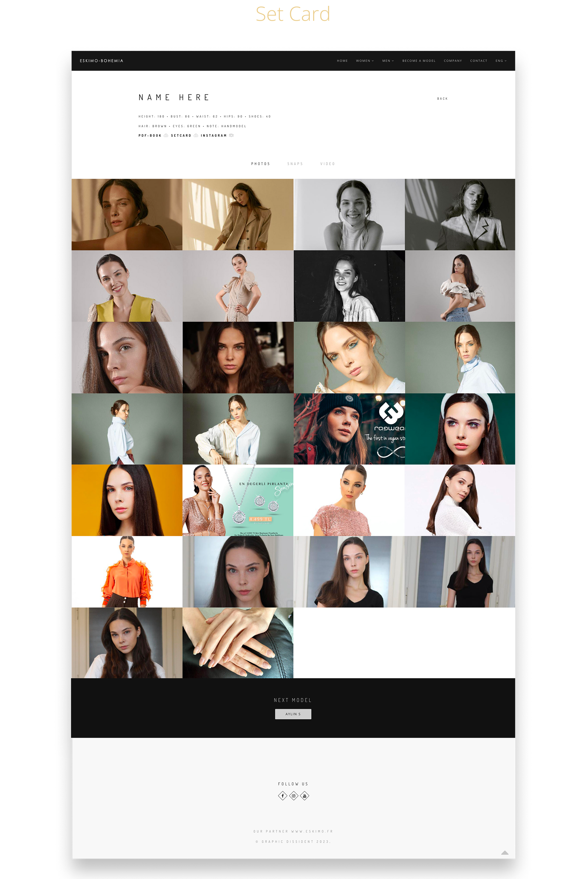
4 · Marking has graphic problems. Change graphics, add model dimensions
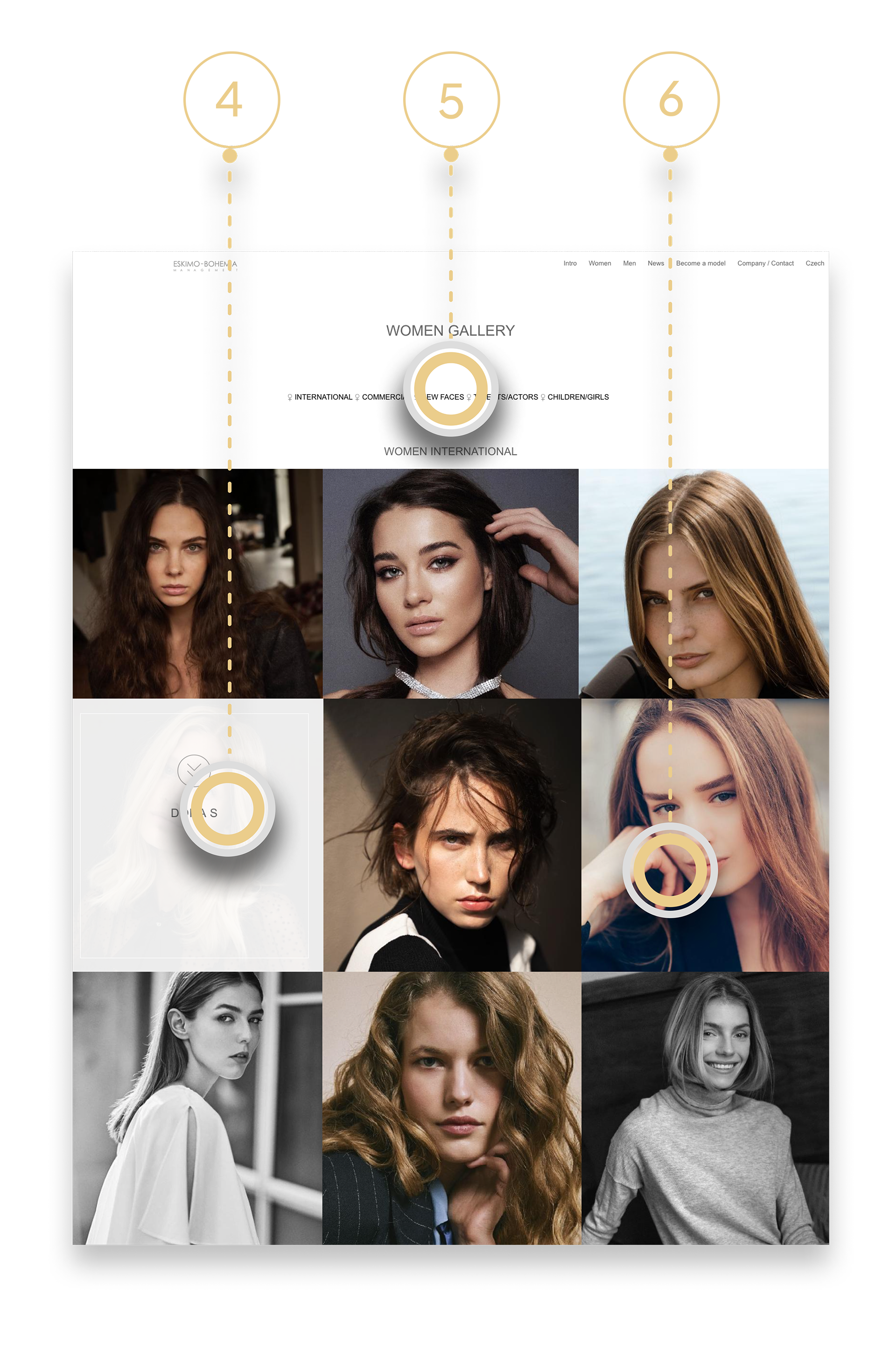
5 · Card sorting is sometimes incomprehensible. I will come up with a new way to open the gallery and name the section
6 · Sometimes the pictures don't fit in the frame. Come up with a new gallery where the photos will keep their size

Competitor Analysis
Get inspiration and identify best practices for website redesign. I performed a competitor analysis.
I started by looking at the sites of several other modeling agencies. One common feature I noticed on these websites was the placement of the Become a Model button to emphasize it as the main call to action. This was an important design pattern to consider to make it easier and more efficient for users to get started


After conducting research and analysis, it's important to understand that users have different needs, expectations, and concerns
The target audience is young men and women between 18-30 years old. the majority of people interested in modeling agency .. are single and they take up a large proportion of about 60%. People work in Arts, Entertainment, Sports, and Media
Adel is a Professional model who lives in Paris. She has been modeling for about 5 years at different companies like Levis, and Diesel, always trying to seek model agencies. Although she doesn't have a specific model agency. She wants to find the best model agencies that she can stay and work with
01
Goals
· Adel wants to find a loyal model agency
· Transperent collaboration
· Accessible application form
· Inspiration from models
02
Pains
· Busy Schedule
· Having hard time to find loyal model agency
· Afraid to be scammed
03
User Story
Adel wants to find an agency when she feels that they care about her so that she can enjoy and travel the world
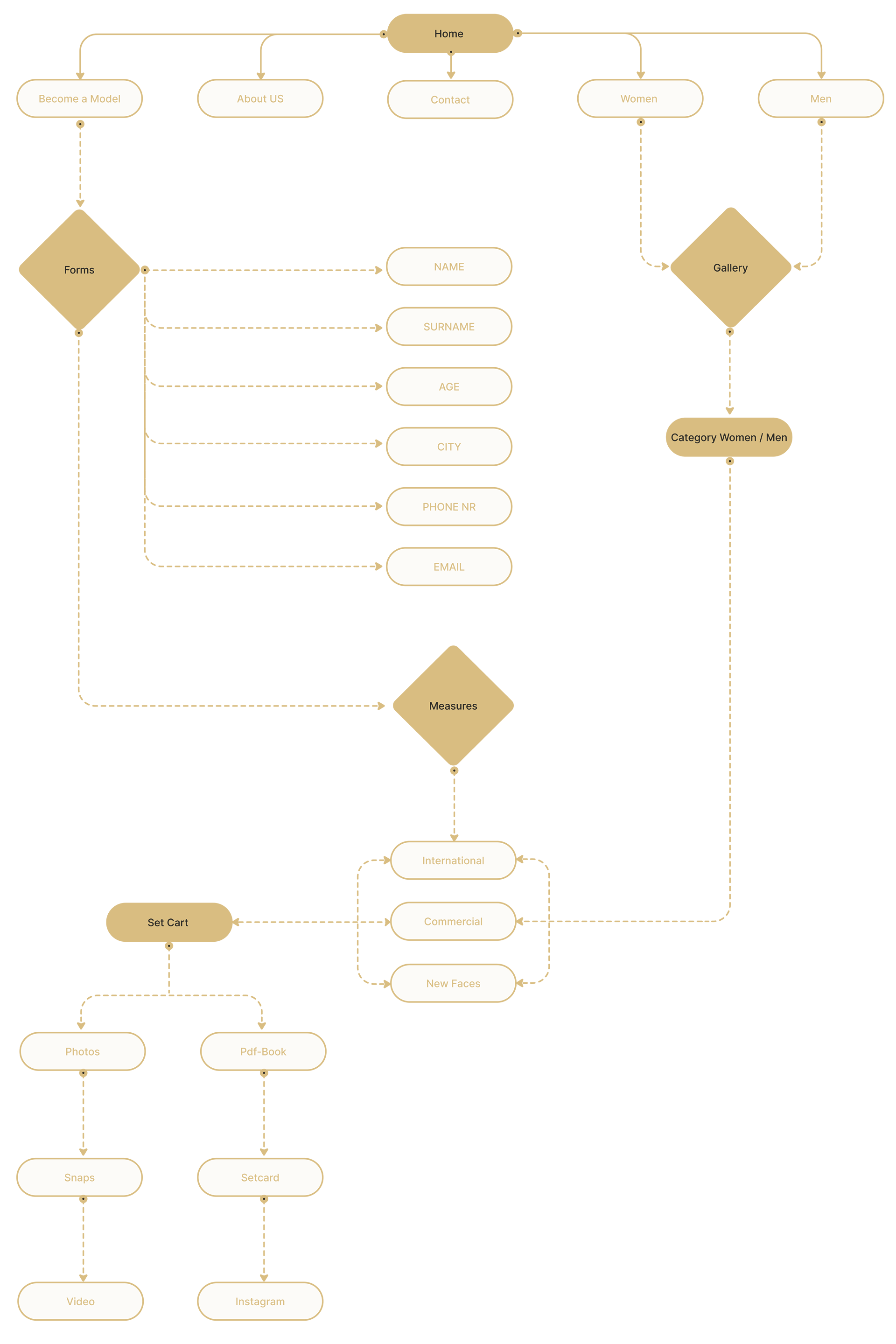
Site Map
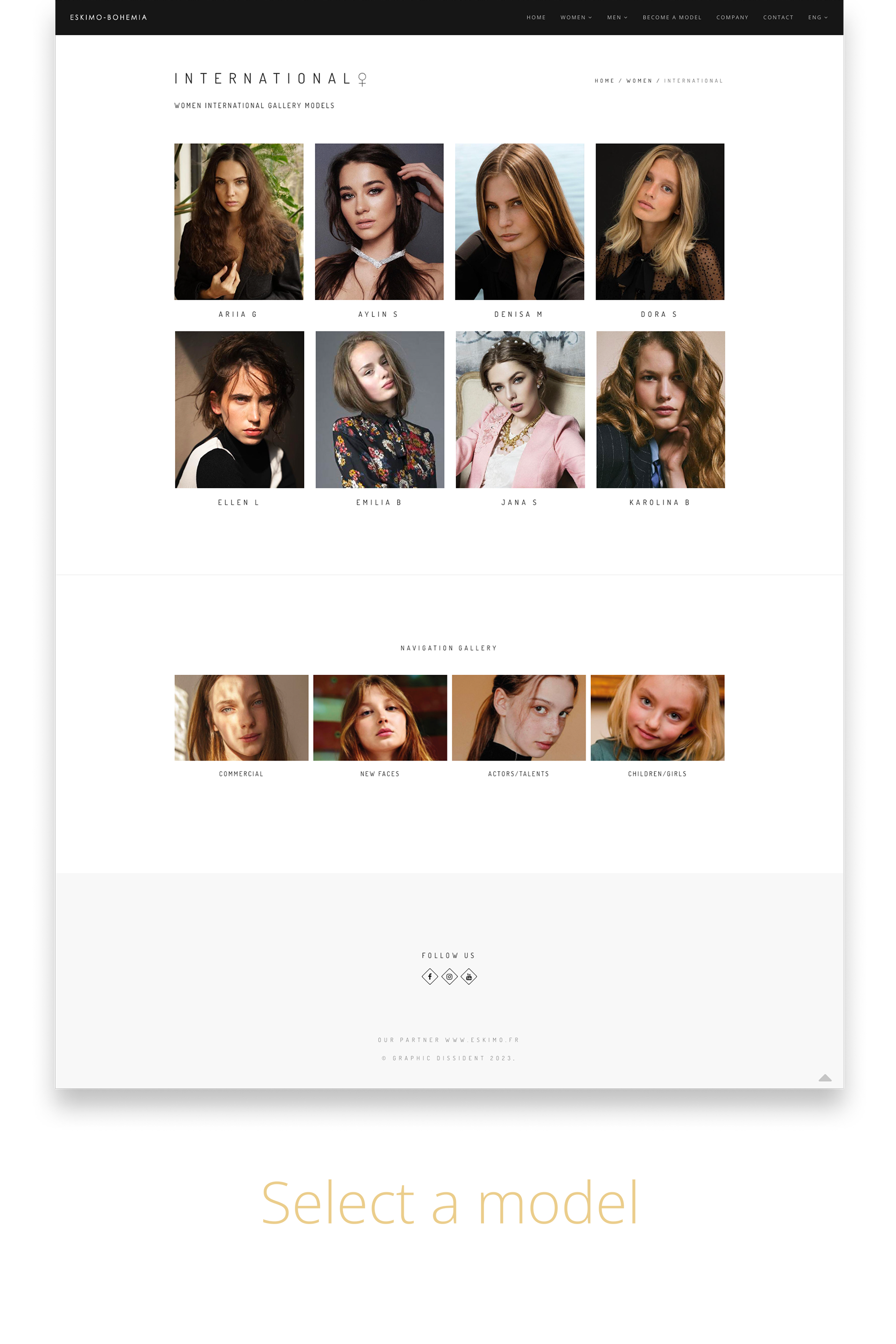
After analyzing the old site and discussing with the owner of the agency and determining our primary persona, I designed a site map, and how the user will move on to the new design. The site requires a new layout of the gallery and categories, we will try to put more emphasis on Become a Model.
Lo-Fi
To Test initial design i started to do Lo-Fi.
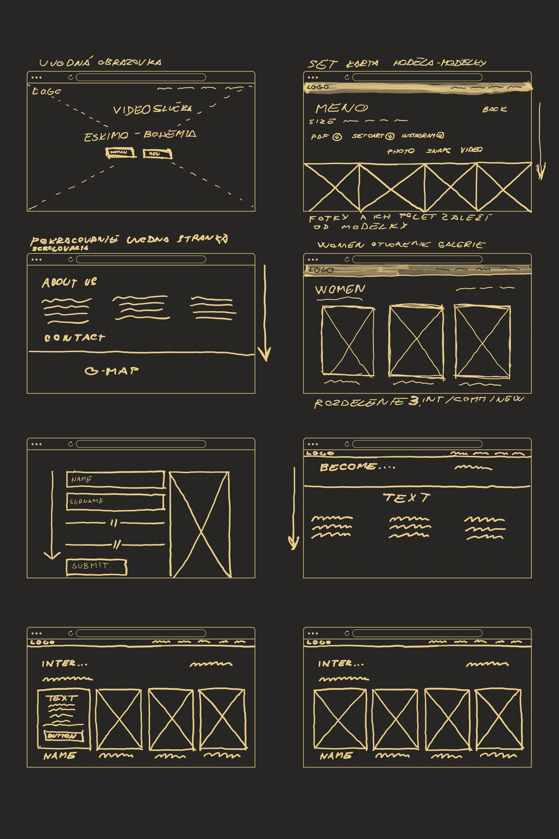
Wireframes
The Wireframing process helped clean my designs


Style Guide
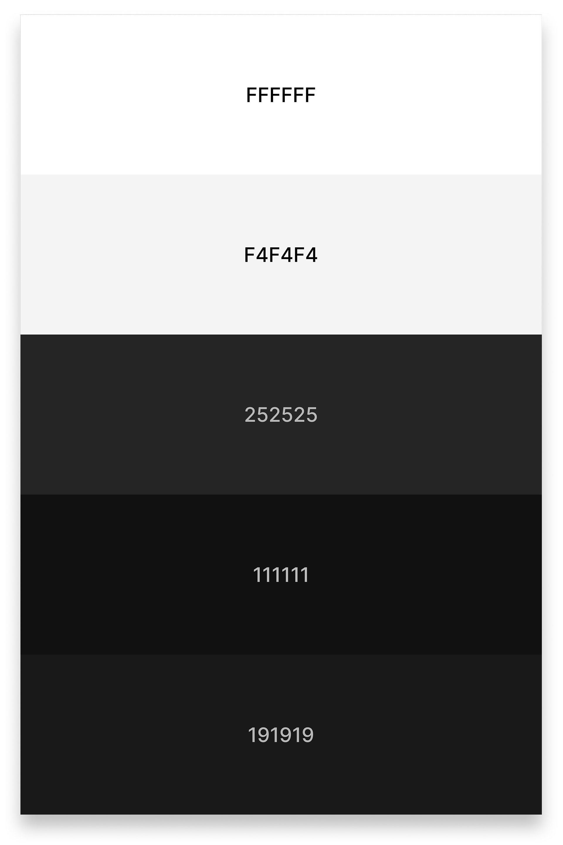
I decided to go with simple colours. To highlight the elegance of the company, there is nothing better than leaving the black and white combination
Typography: Fonts Name: Open Sans Italic and Dosis

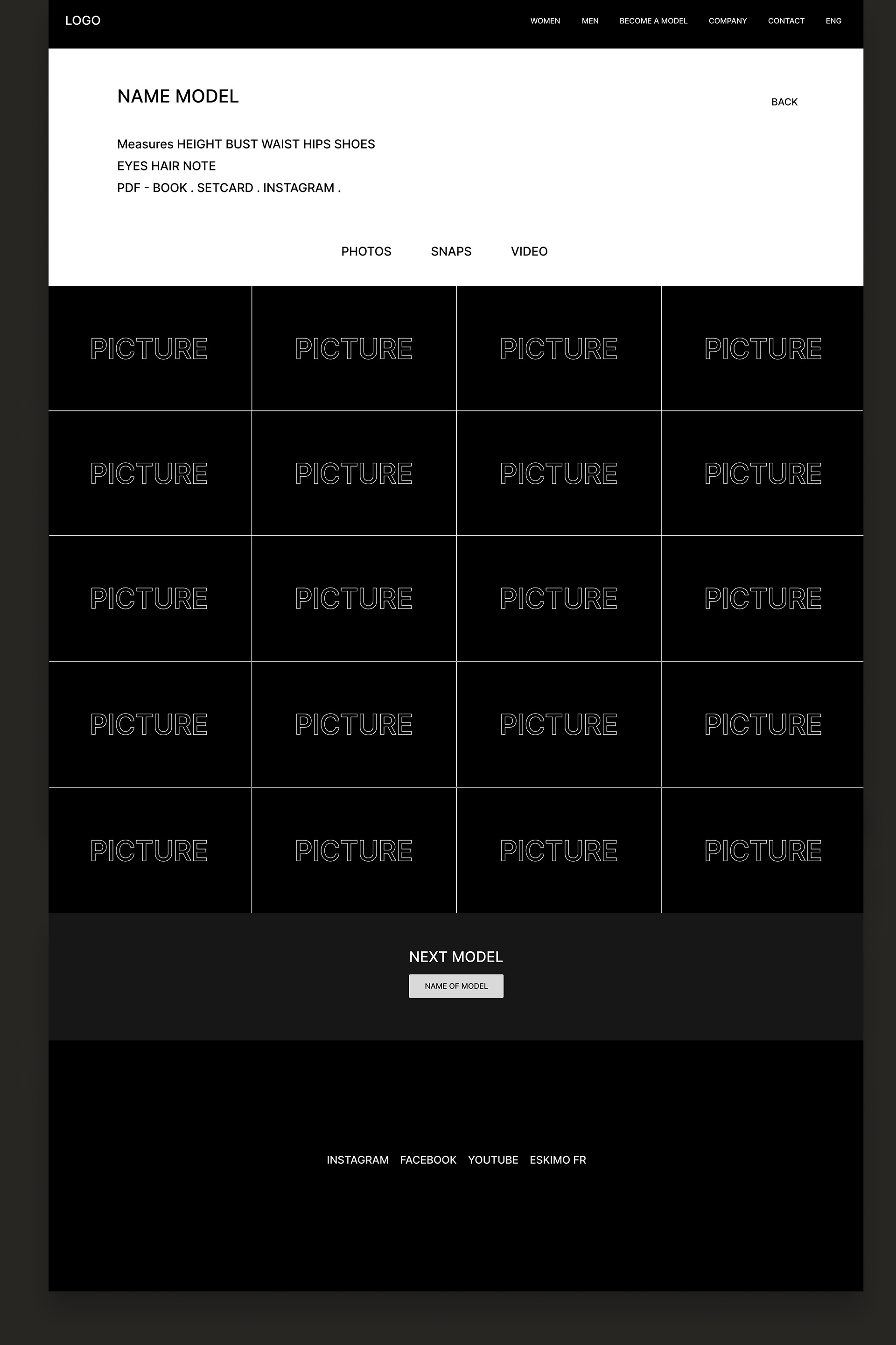
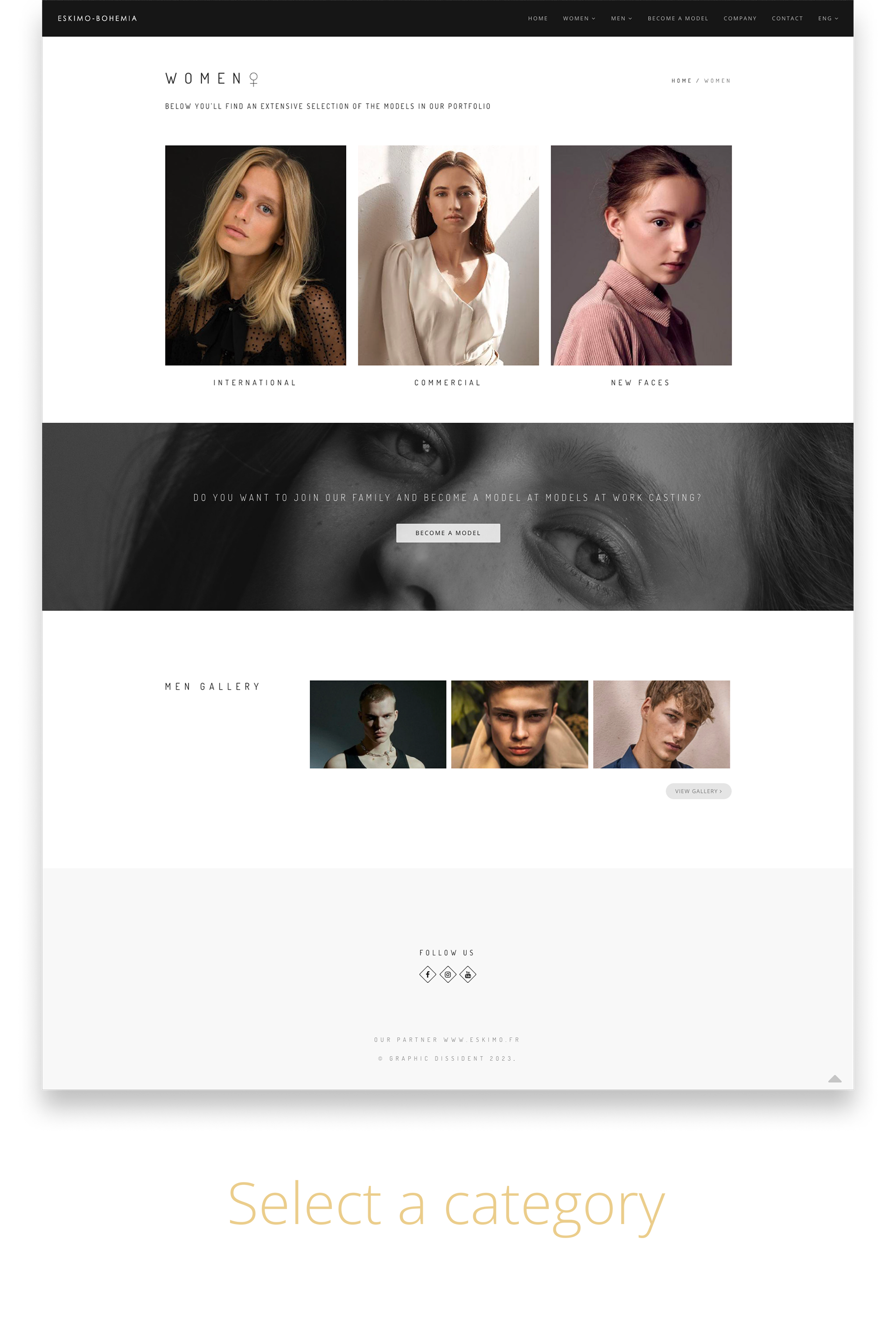
Visual Design
And now I will do the last part of the Visual Design. We activate all the necessary components such as buttons, images, videos, colors, in my case shades.

User Testing
The user tests we performed mainly confirmed that the user was able to navigate functionally and sufficiently. I solved the problem with the opening page so that the user can choose between a female and a male gallery right at the beginning. Thanks to the testing, we found a lot of useful information, for example, another problem was in become and the model, where when entering data, sometimes the user enters incorrect information, for example, writing a street within the city. For your idea of how the site is displayed, I have prepared a prototype in which each of you can try out how the site works. I will be glad for any feedback and critical remark that could move the site forward